
griffin premium for apple
In 2014, Griffin was invited to create a comprehensive power line for Apple Retail. we had never been invited to propose such a broad variety of solutions all at once. The challenge was that we had only TWO weeks to get the proposal together.

LET’S DO THIS
After looking at what solutions Apple was already offering between their own goods and those of our competitors, we came up with five product types that would form the basis of our presentation:
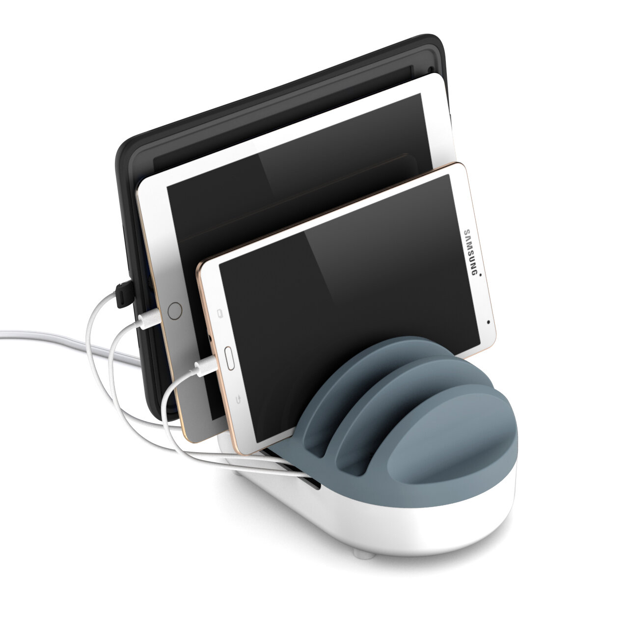
1: The Powerdock Pro: A tabletop valet that can charge any 5 devices, while keeping cords neatly managed.
2: The PowerJolt Premium: An in-car charging solution with clean lines and upgraded materials.
3: The PowerBlock Premium: A wall charger with a new kind of charging circuit and a travel-friendly format
4: The WallDock Premium: A novel wall charger that doubles as a dock. Perfect for kitchens and bathrooms.
5: The PowerBlock Trio: A 3 port wall charger.
I assembled my talented and eager team and laid out our plan. Because it was so rare that we got to create an entire line and propose it at once, I really wanted us to come up with a line aesthetic that would create a sense of unity. I wanted this look to be specifically tailored to align with Apple's design sensibility while being distinct enough to be identifiable as a Griffin.

Parting lines are an eyesore. So, the 1st mandate was that parting lines would always be color breaks so that they looked purposeful and clean. The 2nd mandate is that the products would break specifically to create a 1/3 and 2/3 proportions. The "2/3" section would be white satin finish to reflect the Apple ecosystem. The "1/3" section was a carefully chosen shade we called "Harbor Grey" and represented Griffin. What's more, the Grey section would always be the part that people touched the most, so it wouldn't show dirt and oil.

One of the main things that we had learned during our "Project Rapunzel" initiative is that people want their electronics to blend in with their environments and be easy to live with. We therefore eschewed typical "premium" trade dress like metallic accents or glossy surfaces in favor of a clean, unadorned appearance. Branding was subtly achieved by deboss instead of printing.

Something else that we had learned from previous products and research is the simple fact that people don't like wires to be visible if at all possible, and the same goes for unsightly "wall warts". For the PowerDock Pro, we enclosed the large class 6 adapter inside the housing, and built in a simple cable storage track around it. Everything stays nice and neat. The top section's fins were tall enough to support any tablet or phone.
Many power adapters have USB ports that exit perpendicular to the wall. This makes the cables stick out more and causes problems if your plugs are behind a sofa or other furniture. We therefore had our jacks and hardwired cables exit the product parallel to the wall. This also left the front face of the product clean, so our debossed branding could be placed comfortably

The WallDock was particularly challenging from a number of perspectives. First, the internal componentry of a charger is typically more or less square, and we wanted it to be flattened. Second, If you docked a phone and the entire product fell off the wall, it was a complete fail, so we added a low profile plate that would give the dock better leverage to stay put.

The third challenge was that we wanted the cable to be easy to feed though the dock, but at the same time we wanted it to stay put when the dock wasn't being used so the connector would be kept neat and accessible. We came up with a novel "X" shaped opening in the dock that solved this problem quite well.