Hertz MOBILE APP
it’s all about the journey
OVERVIEW
Hertz Evolution: A New Approach for Navigating a Changing Landscape
Over the past decade, Hertz Car Rental had faced significant challenges in an ever-evolving transportation industry. Rapid technological advancements, such as the rise of ridesharing platforms and the emergence of electric vehicles, had subtly reshaped the preferences and behaviors of consumers. This shifting landscape caught Hertz off guard, as the company struggled to adapt its traditional business model to suit the changing needs of customers. As a result, Hertz experienced declining market share, financial setbacks, and a sense of stagnation.
Somewhere along the way, Hertz had fallen behind and there was no more crucially obvious example of this than their mobile app experience.
My Role
I joined this project in the product designer role after our UX research team had conducted industry and user studies, just as the product design team was ramping up. I worked on the shop and book experience, with a focus on minimizing unhappy paths and streamlining the search process.
My team included 2 UX researchers and a mix of product, UX, and UI design specialists in addition to marketing, development, and operations teams.
The app launched globally November 2nd, 2022.
1: industry trends
It had been some time since Hertz had examined the state of the car rental industry at a high level. Using secondary research, we examined trends from economical, sociological, technological, and environmental standpoints. Many of these insights would later get plugged into opportunities during analysis and brainstorming workshops.

2: user research
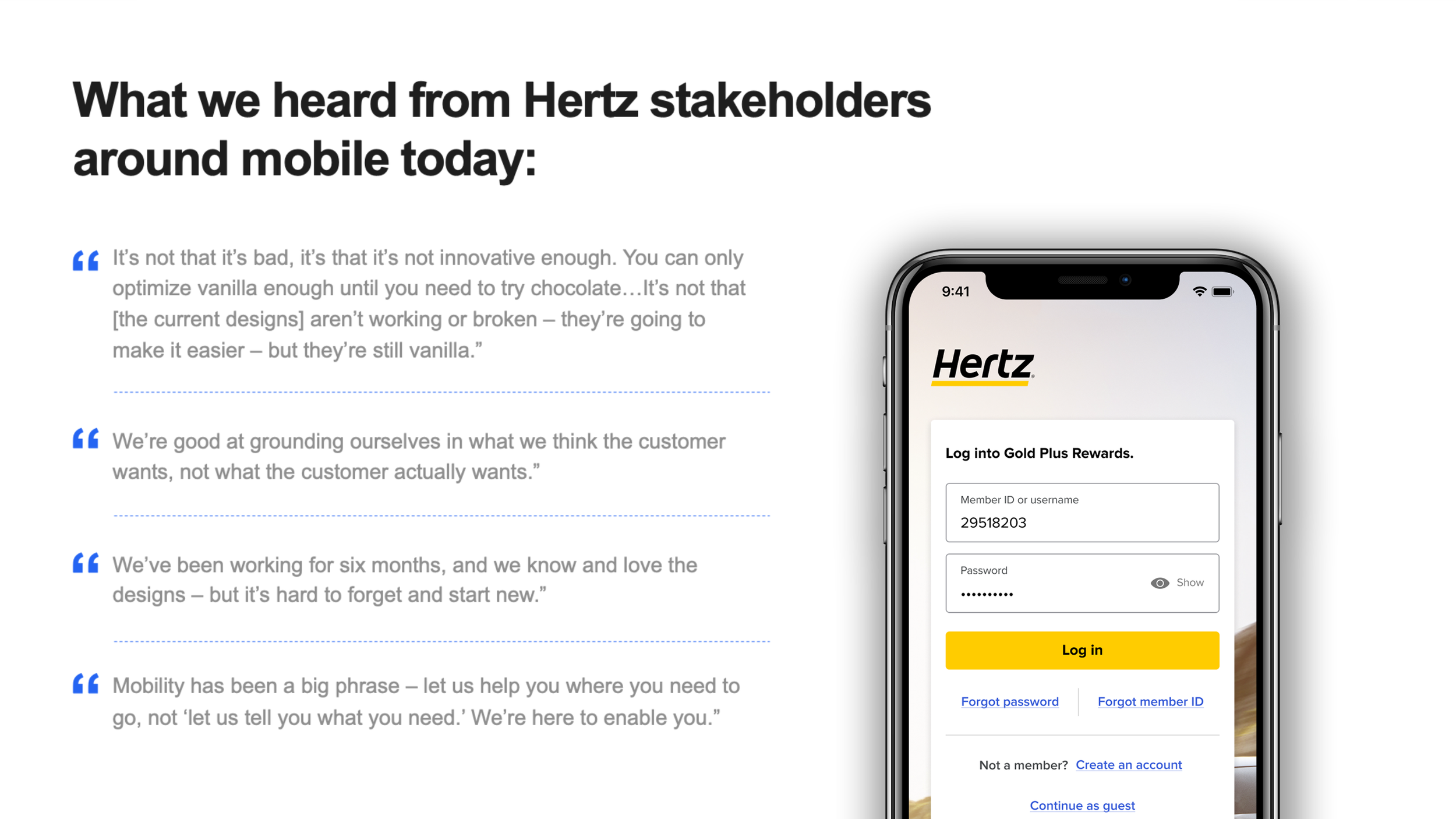
Next, we wanted to gain a keen understanding of our customers’ wants and needs through user research. This was accomplished through user surveys and interviews conducted by Hertz’s UX researchers. Through this, we aimed to truly establish who are customers are, what their priorities are when booking a rental, and what characteristics describe a good experience.


3: stakeholder research
Understanding Hertz’s customers was based both on gaining insights from the users themselves as well as interviewing stakeholders situated at different verticals within the organization, from counter agents to operations managers to technology officers. Some insights would later serve as north stars when rethinking journeys, some would stand out as strategic areas most ripe for innovation.


4:audit
Over the last decade, Hertz had gone through several managerial incarnations to varying degrees of success. Each of these periods was marked by different strategic initiatives and leadership philosophies. Few members of the product design division had been present during the creation of the previous app, and fewer still had any granular understanding of the lifecycles of previous iterations. We needed to understand where our existing experiences were succeeding and failing, and how our competitors’ solutions were behaving in contrast.
During this audit that we examined issues like fragmentation between our different platforms, and how that impacts multiplatform users. We explored not only the experiences of direct competitors like Enterprise and Sixt, but also peripheral industries such as travel and hospitality. We observed the same pain points and frustrations which had been revealed in our user research. We could see where customer drop-off was occurring the most, and began theorizing why. Along the way, we also began to document which legacy constraints of the business (whether technological, organizational, or strategic) were negatively impacting users during the booking flow.
5: personas
Creating personas is essential in marketing, design, and product development, offering a human-centered understanding of the target audience. These fictional characters represent user segments, capturing demographics, behaviors, and needs. Our team created 2 personas which encapsulate user perspectives, motivations, and pain points, guiding decision-making throughout our development process.

6: the journey
To truly understand a user’s wants and needs, its often important to look beyond the app flow itself and look at the entire user’s journey. In this case, the journey begins before they have even thought about needing to rent a car, and it ends after the car has been returned to the lot. This journey contains many flows, and understanding mindset and motivation as they proceed is where the most important insights often come from.
We assembled the journey with data acquired from stakeholders, users, and audits to create a visual timeline punctuated with insights, pain points, opportunities, and questions. This kind of holistic approach allowed our team to recognize the overarching challenges effectively, and in a way that would be intuitive to our stakeholders.

7: Brainstorming
Our journey mapping exercise yielded a lot of insights and questions, with areas of opportunity peppered throughout the timeline. From here, we sorted them into themes and conducted individual workshop sessions devoted to a particular theme. Teams were composed of not just designers, but contributors from across the organization. For each theme, we created problem statements as well as “what-if” and “how might we” statements. Then we began to brainstorm answers to these statements.
8: Prioritization
Our brainstorm sessions yielded a tremendous variety of ideas with potential. But, how do you curate and develop these ideas? We began by selecting goals we wanted to focus on based on outcomes we wanted to drive forward. Then we ranked underlying opportunities on a desirability / feasibility matrix. Finally, we put these opportunities on a roadmap view, with highly desirable and feasible “low hanging fruit” ripe for near term pursuit.


Below are individual ideas and opportunities which our team evaluated using a desirability / feasibility matrix.

Then, each opportunity was evaluated against other opportunities with a comparative feasibility / desirability matrix. Finally, opportunities were prioritized on a roadmap view.

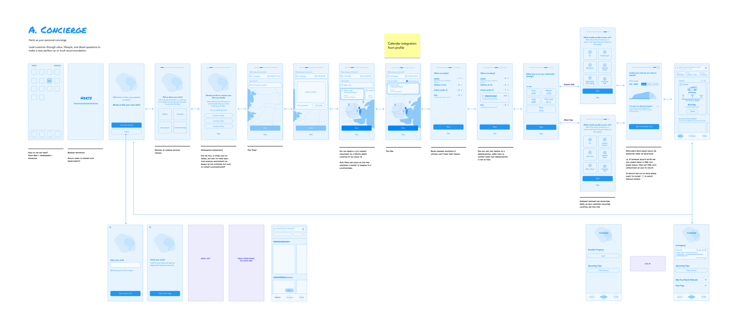
9: solution
With a prioritized roster of desired opportunities, our designers began brainstorming potential solutions. Through an iterative process, ideas were built upon, combined, or refined later in the process. Ideas were arranged into screens, screens arranged into flows. These flows were combined into themed solves.

10: themed solves
Below are some of the themed solves that were created, each one representing a different philosophy towards how to create an ideal booking flow.
“Concierge”: Leads the user through value, lifestyle, and details questions to make a curated recommendation.
“Flexibility First”: Enables discoverability through decision trees, letting the customer decide where they begin. Do they want to search by car type, date, location, price, occasion, or maybe they are feeling lucky?
“Search & Filter”: Natural language search can take time and search up too many options for customer needs in the short term. As an alternative, providing a search option with a robust filter to refine the choice is a compelling alternative.


11: Branding
Brands with an established visual legacy require a great deal of care when it comes to design. This is especially true when it comes to Hertz. The challenge was to build on that recognition while bringing a fresh and contemporary feel to the experience.
Through a series of workshops, we explored numerous aesthetic treatments, first through mood boards and then through application to key screens such as the home screen.
Our team created an updated visual language that would serve as source of truth for not only the app, but future redesigns of mobile and desktop platforms.

UI MOOD BOARDS


12: Medium Fidelity Wireframes
While the UI framework was being developed, the product design team continued to create task-oriented flows in wireframe form. Iterations were user-tested against each other and refinement continued until we were satisfied with the overall user experience. Some of the biggest improvements came in the form of reduced overall clicks-per-task, greatly reduced scroll depth, more intuitive navigation, better overall responsiveness, and vastly improved affordance to midflow user changes.

13: High Fidelity Wireframes
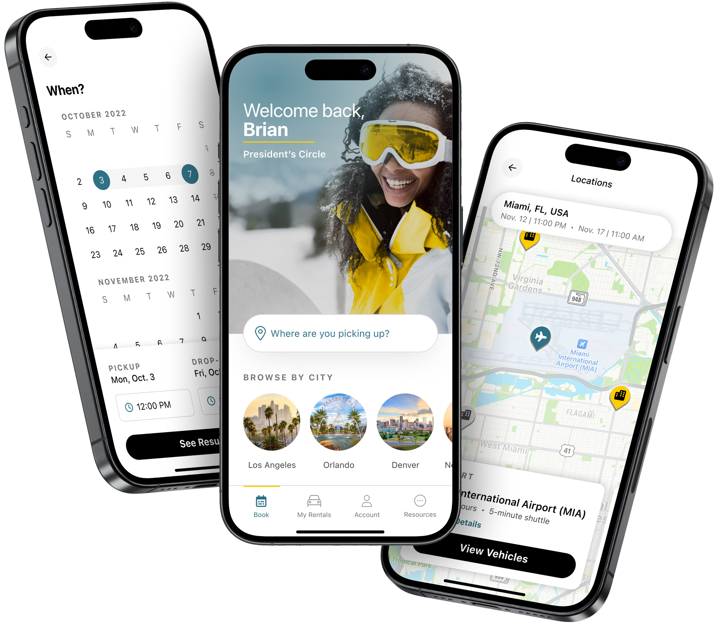
With the UX fully considered, tested, and verified, the final step was to apply our new brand UI to the experience to create the finished product. This included not only colors, layouts, and fonts but also transition effects, animations, and imagery.

COMPLETION
There are a great number of metrics, both qualitative and quantitative that can be used to measure the success of a project such as this. Does the result generate more revenue per unique user? Does the user complete the journey with less overall clicks? Does the user feel more confident and informed as they go through the flow? Does the experience help build confidence in the brand? Do customer service calls go down? Does overall engagement go up?
By all of the above metrics, this new app experience was an unequivocal success, but to me the greatest success comes down to one metric above all else: When an effort brings together the efforts and perspectives of so many people, it’s often most difficult to maintain design intent, to keep what was most important where it needed to be throughout the inevitable chaos of product development. A good designer keeps that intent.
