
ihome ip4: design boom

BOOMBOXES USED TO BE COOL
I spend a lot of time looking at products and trends from the past, trying to figure out ways of creating language from a different frame of reference. In the world of consumer electronics, nothing fascinates me more than the 1980’s ghetto blaster craze. Much like the Walkman and the iPod, these devices came to be at exactly the right time. They were heavy, impractical, and as far removed from fundamentally “good” design as you could possibly get.
And yet, these products were irresistibly cool.

WHAT HAPPENED?
Over the past few years, we made several attempts to create an iPod boombox, to varying degrees of success. None of them qualified as a home-run. The products were well-designed, with thoughtful features, good performance, and competitive pricing. The competition had made efforts in a similar vein with largely similar results. Was it that people viewed the iPod as an implicitly private device? Did the existing crop of boomboxes lack personality? Did our products change that much since the 1980’s, or did we? I took a look at the landscape and could not deny that something was missing. Our products had become too reserved, too serious. They lacked joy, and they were not cool.
good product is lifestyle
Boomboxes are supposed to be expressive, bold, and fun. If I'm going to lug around 20 lbs of plastic, they had better be the 20 coolest lbs on earth.

The Ancestor
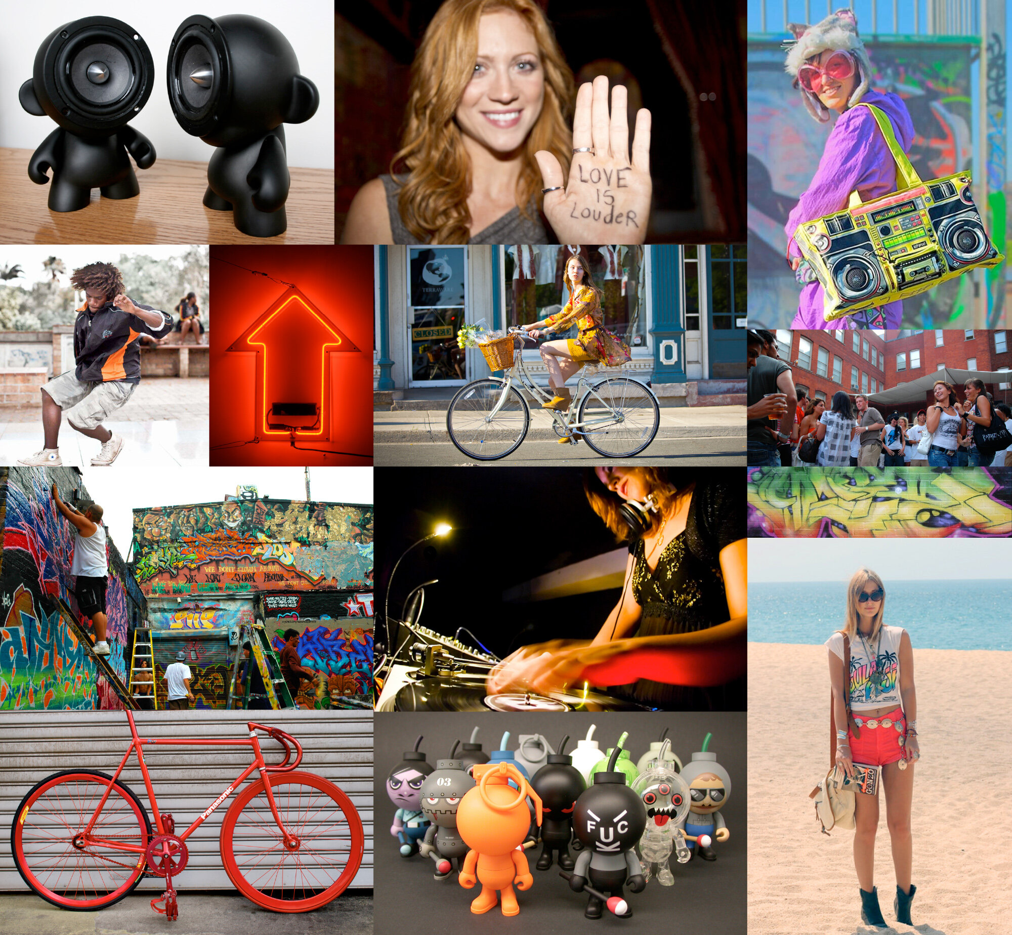
I went back through my materials, looking for the qualities that made 80’s boomboxes so iconic.
SIZE: The best models were almost too big to carry.
PROFILE: Emphasizing the height and width of the product, the depth is proportionally minimal.
CONTROL: Myriad adjustments to tune your sound (EQ, loudness, boost, balance, etc.)
DETAILS: As much excessive detail (graphic, tooled, painted) as possible.
POWER: Above all else, ghetto blasters of the 1980’s gave off an unmistakable aura of potency.
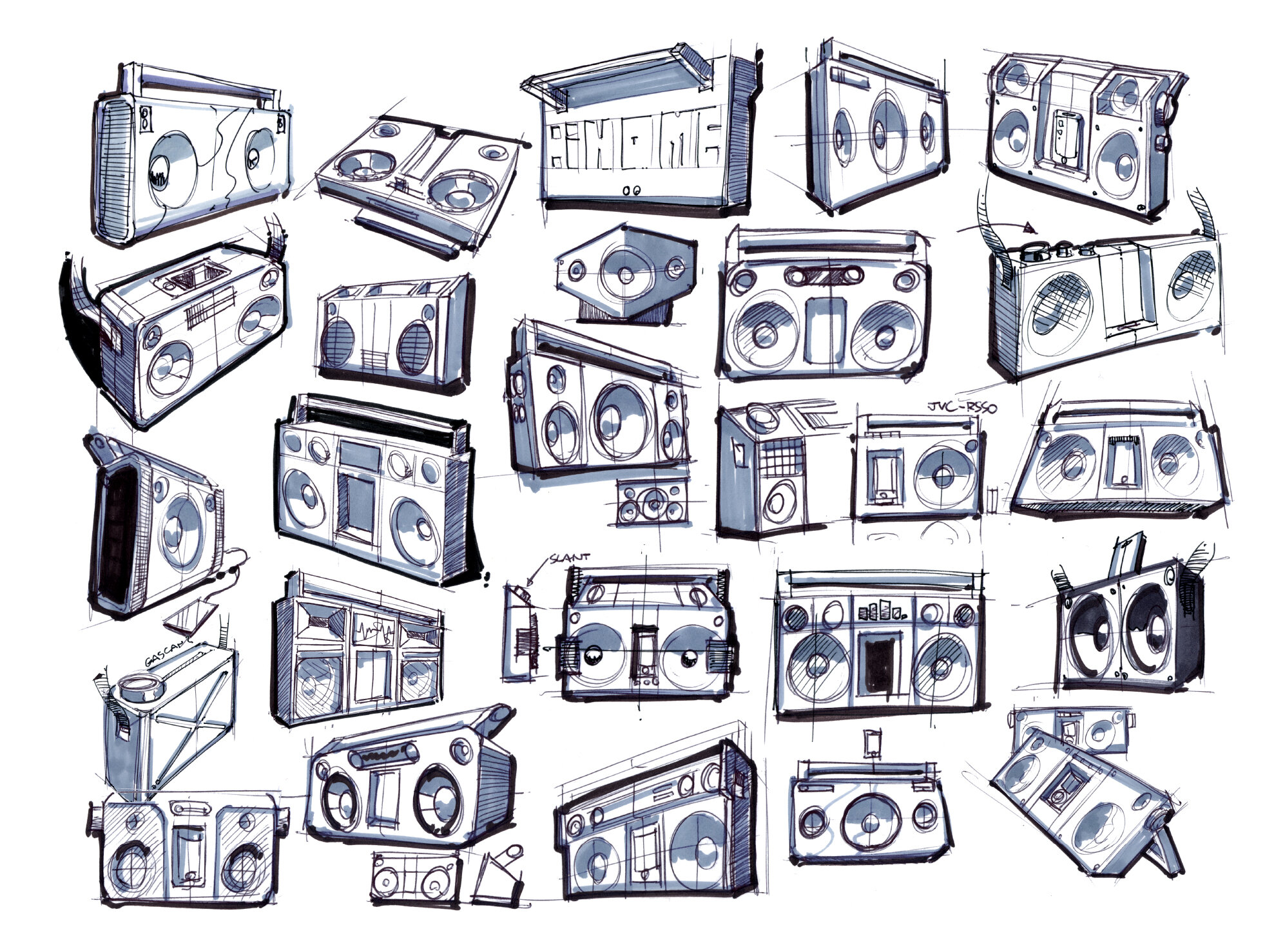
I GET SKETCHING
With a wealth of imagery and language to work with, I began ideating all sorts of shapes and configurations. These things are fun to draw!

FIRST CONCEPT
My first idea was clean and minimal, taking the proportions and basic detailing of a 1980’s boombox and removing everything extraneous. The main body was made out of two pieces of stamped aluminum (we were in talks with Foxxconn at the time and I was eager to explore their manufacturing capabilities). The woofers and tweeters were hidden behind matte black grilles. The main controls were located on the sides of the product, emphasizing the extruded, directional thrust. I liked the overall effect but felt that I was breaking my own directive by making the product sophisticated and minimal instead of brassy and fun. Many members of my team agreed.

SECOND CONCEPT
I decided to take more literal license from the ghetto blasters of the 1980’s. Generous, almost excessive application of metallic details were laid over a matte black textured cabinet to give the concept a menacing urban vibe. Features like a 7 band equalizer, guitar input, nubby-textured handle, and oversize knobs helped give the concept authenticity. I felt that while the effect was smart and aggressive, it still wasn’t cool...It’s a notoriously hard quality to pin down.

REtHINKING WITH COLOR
My doubts over the second concept brought two questions into the spotlight. How do you make a product fun without it looking like a toy? And, how do you make a concept nod to the past without making it look dated? I started to think about color re-interpretation, maintaining the original design elements, but altering the color in new and striking ways. The result is intended to jar the mind out of its normal chromatic association with an iconic form. At once familiar and new, the effect can be as simple as dipping an object in a can of paint.

THIRD CONCEPT
Based on the color-re-interpretation trend, I began drawing the quintessential 1980’s boombox, minding proportion, minimizing detail. I coated it with a layer of matte rubber paint in a palette of neon tones and a smart urban grey. I showed the concept to the team, they were excited and I was thrilled! I had found the missing ingredient.
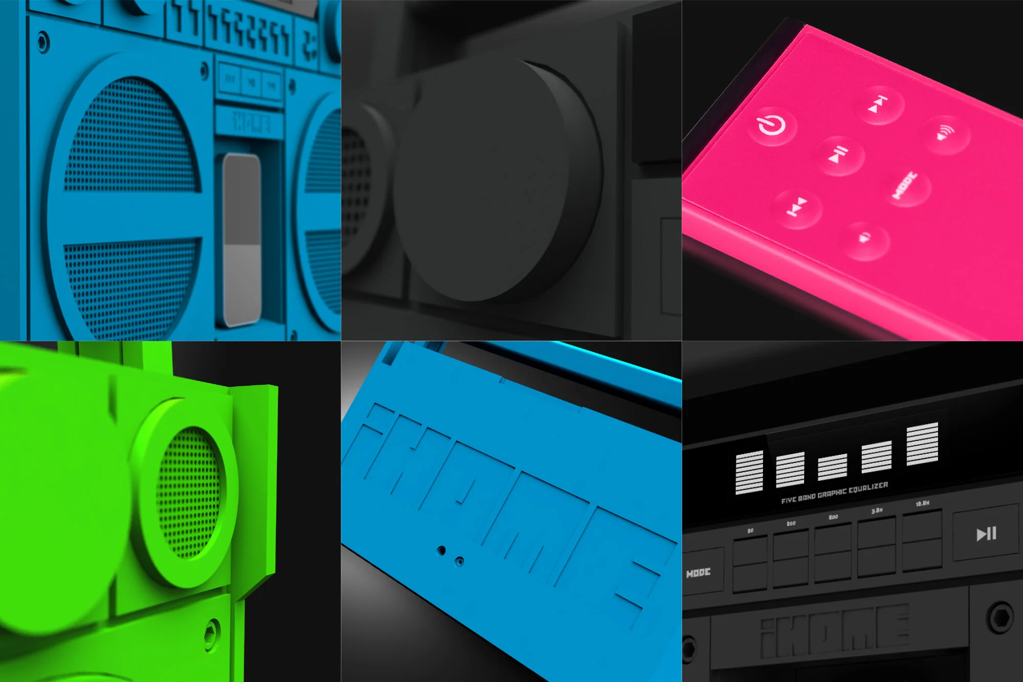
THE DETAILS
KNOBS: It took four different damping mechanism setups to settle on a knob design that had a smooth, weighty feel, conveying precision and quality.
REMOTE: A magnet embedded inside the IR remote keeps it in its recess while in transit, while also lending the right amount of heft.
LCD: It was tricky designing a segment-driven LCD that could display both equalizer and radio station information within the same viewing area.
LOGO: Our traditional iHome logo simply didn’t mesh due to the severe rectilinear form of the product, so I designed a new variant for this application.
GUARD: To prevent damage to the knobs in the event that the iP4 gets knocked on its face, I added protrusions, made out of impact-resistant polycarbonate.

RESULT
The iP4 was released as an Urban Outfitters exclusive for the 2011 holiday season and the reaction was huge. The product got iHome an immense amount of publicity and by the end of December we had gotten commitments from the majority of our retail channels. The iP4 was not only sales success but also a strong brand statement, compelling consumers to think about iHome in a new way.

THE PACKAGE
The iP4, as a new brand statement, needed a fresh take on packaging . Too many products tried for an urban vibe and missed, looking forced and immature. I kept the grittiness and graffiti in the background, allowing the product to take the spotlight. Logos and typography, along with the natural cardboard aesthetic of the box, created an effect that was both retro and current. The first time I saw the iP4 on shelves at Urban Outfitters, I knew we had gotten it right.
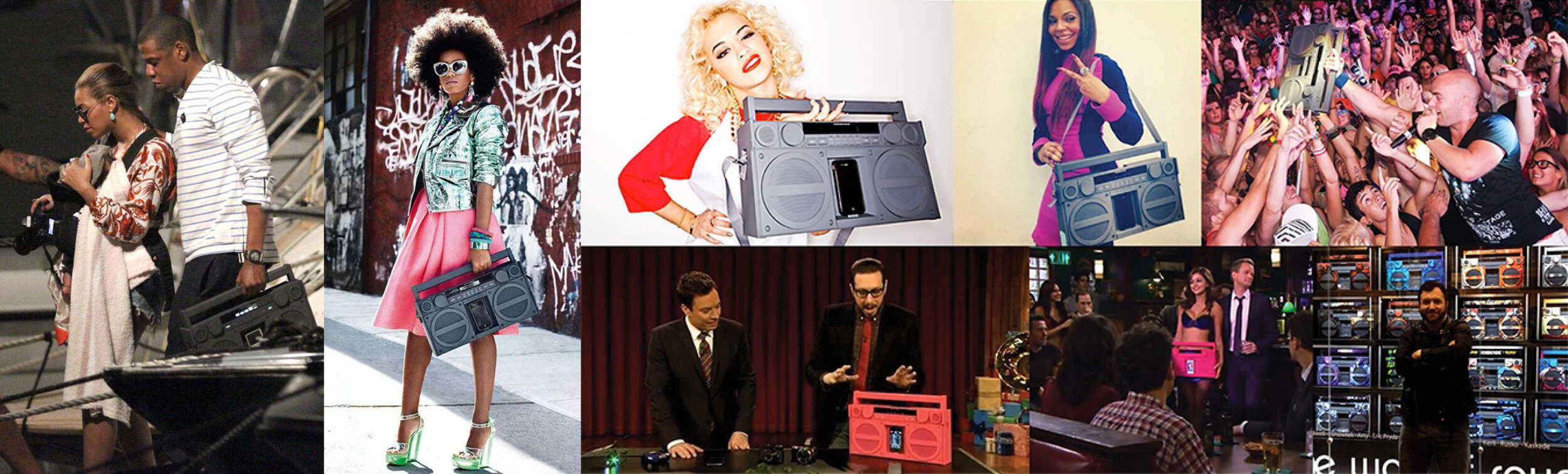
THE REACTION
One thing that I could have never anticipated was how much celebrity the iP4 would gain shortly after the initial launch. The product could be spotted everywhere from French Glamour Magazine to The Tonight Show. The day that some paparazzi took snapshots of Jay-Z, confidently clutching an iP4 with Beyonce at his side as they boarded their yacht, our website nearly crashed from the tidal wave of enthusiasm. What a fascinating experience.